
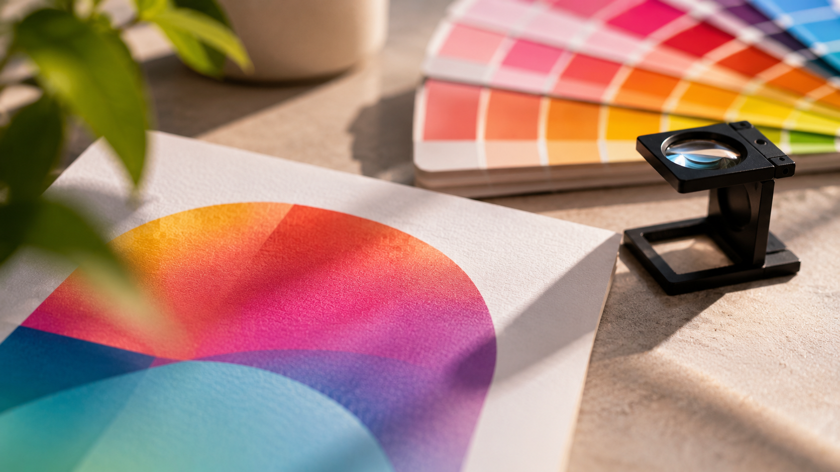
You spent hours getting the colors right. The blue was crisp, the orange popped, and the black looked deep and clean.
Then the brochures arrive, and everything looks a little flatter.
That's not a printing mistake. It's the difference between RGB and CMYK, and once you understand it, you can design for it.
What is the difference between RGB and CMYK?
RGB (red, green, blue) is how screens make color. CMYK (cyan, magenta, yellow, key/black) is how printers make color.
The difference comes down to light versus ink:
- RGB is light. Your screen starts with black and adds red, green, and blue light to build color. More light means brighter color, and all three at full strength make white.
- CMYK is ink. Paper starts white and ink absorbs light. More ink means darker color, and the colors combine toward a dark, muddy tone.
Screens glow and paper reflects. That one fact explains most of the gap.
Why printed colors look different from your screen
Three things work against you when you compare a monitor to a printed piece.
1. RGB can show colors CMYK can't
This is called gamut, the range of colors a system can produce. RGB's is wider. Some of the most vivid colors on your screen, such as electric blues, neon greens, bright oranges, and hot pinks, fall outside what CMYK inks can reproduce.
When an RGB file is converted for print, those colors get swapped for the closest match. The match is usually duller.
2. Screens are backlit
A monitor shines light at you. A printed page only reflects the light in the room. Even a perfect color match will look less luminous on paper.
3. Every screen is different
Brightness, color temperature, and display calibration vary from one device to the next. Your laptop, your phone, and your designer's monitor all show the same file a little differently. CMYK values are the one reference point that stays fixed.
RGB vs CMYK: when to use each
The rule is simple. Design for where the work will end up.
| RGB | CMYK | |
|---|---|---|
| Made of | Red, green, blue light | Cyan, magenta, yellow, black ink |
| Best for | Websites, social media, email, apps, video | Brochures, postcards, flyers, labels, banners, posters |
| Color range | Wider, brighter | Narrower, more muted |
| Starting point | Black screen | White paper |
If a piece will live in both places, like a logo that goes on your website and your packaging, keep an RGB version and a CMYK version, and don't convert back and forth.
What is rich black (and why does it matter)?
Black is where a lot of print projects go quietly wrong.
In CMYK, standard black is 100% K (black ink) and nothing else. It's perfect for body text and fine lines, but over a large area it can look thin and slightly gray.
Rich black adds the other inks underneath the black to make it deeper and more solid. A common mix is:
C 60 / M 40 / Y 40 / K 100
Rich black works best for:
- Large solid black backgrounds
- Big headlines and bold graphics
- Full-bleed black panels on brochures, postcards, and menus
Don't use rich black for small text. Because it layers several inks, even a tiny misalignment on press can make small type look blurry or fuzzy. For text, stick with plain 100% K.
Also avoid building a black from 100% of every ink (C 100 / M 100 / Y 100 / K 100). That's too much ink for paper to handle. It can smear, dry slowly, or cause problems on press.
How to set up your file in Canva
Canva works in RGB by default, which surprises a lot of people. You can still get a print-ready file out of it.
- Design at the right size. Use your printer's exact dimensions, and add bleed if needed.
- Turn on bleed and crop marks. When you download, select Show print bleed and Crop marks and bleed.
- Download as PDF Print. Choose File > Download > PDF Print.
- Switch the color profile to CMYK. In the download settings, set Color profile to CMYK.
One catch: the CMYK PDF export is part of Canva Pro, so it's not available on free accounts. If you're on a free plan, ask your printer how they'd like to handle conversion.
Also, remember that the design itself is still built in RGB. Canva converts on export, so bright colors will still shift. Check the exported PDF, not just the Canva screen.
How to set up your file in Adobe Illustrator
Illustrator gives you the most control. Do this at the start of the project, not the end.
For a new document:
- Go to File > New.
- Choose the Print category.
- Under Advanced Options, set Color Mode to CMYK Color.
- Add 3 mm / 0.125" bleed on all sides, unless your printer specifies otherwise.
For an existing file:
- Go to File > Document Color Mode > CMYK Color.
- Open your swatches and check that every color is a CMYK swatch.
- Rebuild any neon or oversaturated colors you don't like in CMYK.
Before you export:
- Go to View > Proof Setup and turn on Proof Colors to preview how your colors will print.
- Convert fonts to outlines or embed them.
- Export as PDF using a high-quality print preset (PDF/X-4 is a common choice).
- Keep images at 300 DPI at final size.
Common RGB vs CMYK mistakes to avoid
- Converting at the last minute. Switching to CMYK after the design is done gives you color surprises when it's too late to fix them. Start in CMYK.
- Trusting your screen over your swatches. Choose colors by CMYK values, not by how they look on your monitor.
- Using web graphics for print. Social media images are small, low-resolution, and in RGB. They rarely hold up on paper.
- Using the wrong black. Rich black for backgrounds, 100% K for text.
- Skipping the proof. A printed proof is the only way to see what your piece will really look like.
What this means for your business
Color consistency is part of how people recognize your brand, and print is where it's easiest to lose.
- Set up for print from the start. Working in CMYK gives you fewer surprises and fewer reprints.
- Define your brand colors in CMYK. Keep a written list of CMYK values for your brand so every postcard, label, and banner matches.
- Expect a small shift. Even in a perfect CMYK workflow, ink on paper won't look exactly like light on a screen. Plan for a close match, not an identical one.
- Proof before the full run. A quick check of a physical sample costs far less than reprinting a whole order.
Print the colors you designed
The screen-versus-print gap is normal, and it's manageable. Work in CMYK, choose colors by their values, use rich black where it counts, and check a proof.
At Quixprint, our team reviews your files before they go to press, so color and setup problems get caught early. Whether it's brochures, postcards, roll labels, or banners, we'll help you get colors that look the way you meant them to.
Not sure if your file is print-ready?
Send us your artwork and tell us what you're printing, and we'll take a look before anything goes to press.
Get in touch