
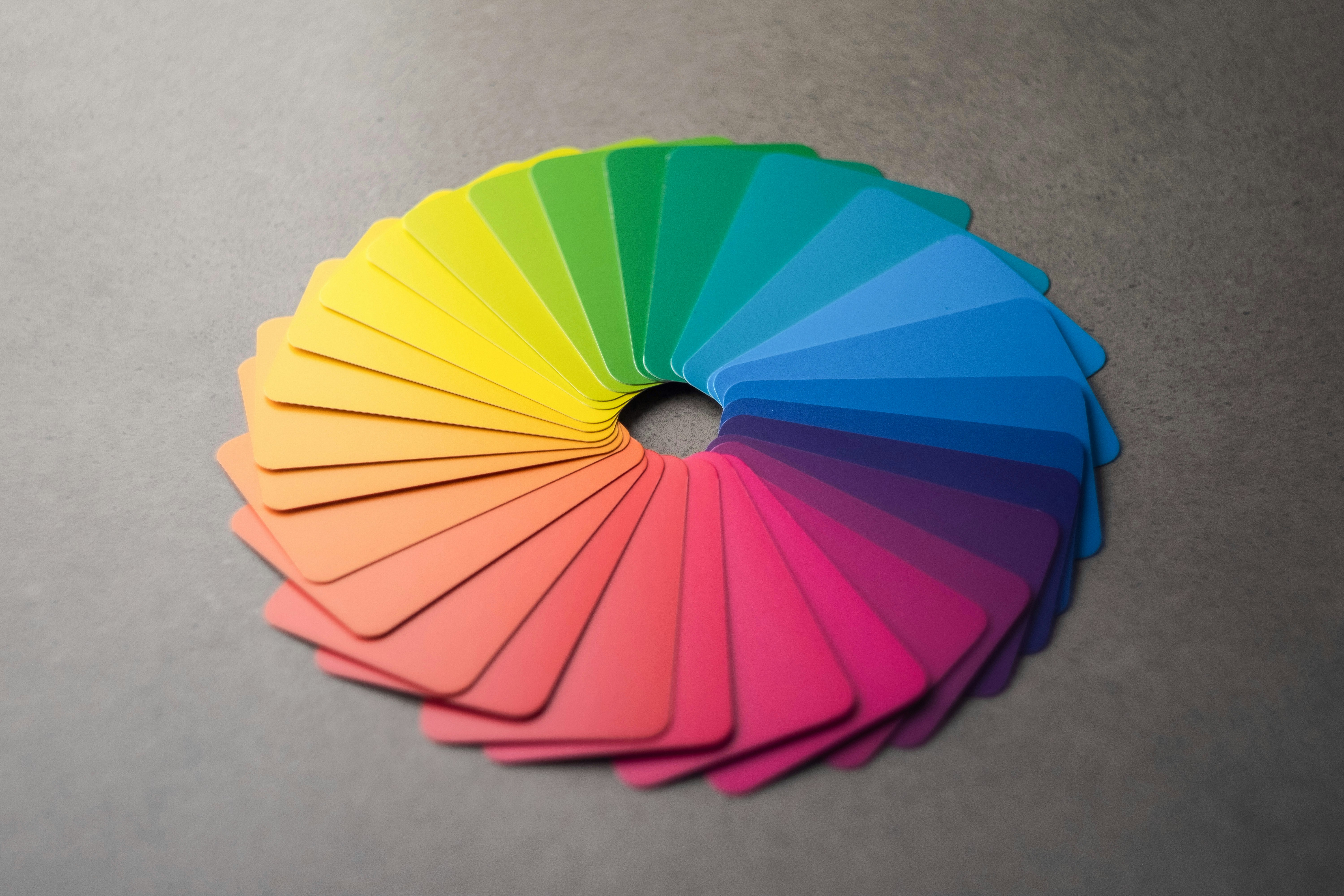
Have you ever wondered why so many banks use blue logos—or why health and wellness brands so often surround themselves with shades of green? It is usually not an accident.
Color is one of the most powerful tools in marketing and design. Before a customer reads a single word on your packaging, brochure, product label, or direct mail piece, color has already started shaping their impression of your brand.
Whether you are designing roll labels, product packaging, brochures, catalogs, or other printed marketing materials, choosing the right colors can influence how customers perceive your business—and whether they stop to take a closer look.
Color creates an immediate impression
Customers often make fast, instinctive judgments about products and brands. Color helps communicate personality and emotion before a customer has had time to process the rest of the design.
The colors used in a design can make a brand feel:
- Trustworthy and dependable.
- Luxurious and sophisticated.
- Energetic and exciting.
- Natural and environmentally conscious.
- Friendly and approachable.
- Modern and innovative.
Instead of asking only which colors look good together, ask a more important question: What do you want your customers to feel?
Blue: trust and reliability
Blue is one of the most commonly used colors in branding because it is frequently associated with trust, security, professionalism, reliability, and calmness.
That is why blue appears so often in financial services, healthcare, technology, and corporate branding. On brochures, presentation folders, sales sheets, and other professional marketing materials, blue can help communicate credibility and confidence.
Blue is commonly used by:
- Financial institutions and insurance companies.
- Healthcare organizations.
- Technology companies.
- Professional service businesses.
- Corporate and business-to-business brands.
Darker blues often feel established and authoritative, while brighter blues can feel more modern, friendly, and energetic.
Red: appetite and excitement
Red is difficult to ignore. It can create feelings of excitement, passion, energy, and urgency. It is also widely associated with appetite, which helps explain why it appears so frequently in restaurant branding and food packaging.
On product labels, point-of-sale displays, postcards, and promotional materials, red can help an important message command attention. Because it is such a strong color, however, it is often most effective when used deliberately rather than covering the entire design.
Red is commonly used for:
- Food and beverage packaging.
- Restaurant menus and marketing materials.
- Sales and limited-time promotions.
- Bold calls to action.
- Brands that want to convey speed, passion, or excitement.
Green: natural and healthy
Green is closely connected with nature, health, sustainability, growth, and freshness. It is a natural choice for brands that want to emphasize organic ingredients, environmental responsibility, or personal wellness.
Green can work especially well for supplement labels, coffee packaging, skincare products, natural foods, and eco-conscious products. When paired with an uncoated paper, matte laminate, or textured label material, it can create an earthy and premium appearance.
Green is commonly used for:
- Natural and organic products.
- Health and wellness brands.
- Sustainable and environmentally friendly packaging.
- Food, coffee, skincare, and supplement labels.
- Outdoor, agricultural, and plant-related businesses.
A deep forest green can feel refined and luxurious, while a brighter green may communicate freshness, energy, and growth.
Black: luxury and sophistication
Black is commonly associated with luxury, elegance, sophistication, exclusivity, and power. It can give a design a premium appearance without requiring numerous decorative elements.
In commercial printing, black becomes especially effective when combined with specialty finishes such as soft-touch coating, metallic foil, embossing, or raised spot UV. A minimal black package with one carefully selected finish can often feel more luxurious than a complicated design filled with competing elements.
Black is commonly used for:
- Luxury product packaging.
- Cosmetics and skincare products.
- Wine, spirits, and specialty beverages.
- Premium consumer products.
- High-end invitations, brochures, and presentation materials.
What other colors communicate
Yellow: optimism and warmth
Yellow is commonly associated with optimism, happiness, creativity, and warmth. It can help a brand feel friendly, youthful, energetic, and approachable.
Because bright yellow can be difficult to read when used for text, it often works best as an accent color or against a darker background.
Orange: confidence and enthusiasm
Orange can communicate enthusiasm, friendliness, confidence, and adventure. It offers much of the energy of red while often feeling more playful and approachable.
Orange is often effective for promotional materials, food packaging, fitness brands, and businesses that want to appear energetic without feeling overly aggressive.
Purple: creativity and imagination
Purple has long been associated with royalty, creativity, imagination, and luxury. It is commonly seen in beauty, wellness, technology, and specialty-product branding.
Dark purple can feel premium and sophisticated, while lighter shades such as lavender can feel calming, gentle, and creative.
White: simplicity and cleanliness
White can communicate cleanliness, simplicity, openness, and modernity. Just as importantly, white space gives the other elements of a design room to breathe.
A well-designed printed piece does not need to fill every available inch. Strategic white space can make a brochure, label, or package feel more organized, refined, and easier to understand.
Color on a screen is not always color in print
One of the most important considerations in print design is that a color viewed on a monitor will not necessarily look exactly the same when it is printed.
Digital screens create color using red, green, and blue light, commonly known as RGB. Most full-color commercial printing uses cyan, magenta, yellow, and black inks, commonly known as CMYK.
Because screens produce color with light and printed materials produce color with ink, certain bright or highly saturated colors may appear slightly different when converted from RGB to CMYK.
A printed color can also be affected by:
- The paper or label material.
- CMYK color conversion.
- Pantone color specifications.
- Matte, gloss, or soft-touch finishes.
- Metallic and transparent substrates.
- Coatings, laminates, and specialty print effects.
For example, printing on silver BOPP can allow the metallic material to shine through selected portions of a design. A matte finish can make colors feel softer and more understated, while a gloss finish can increase contrast and visual intensity.
Paper selection matters as well. The same ink color may look different on bright white coated paper than it does on an uncoated, cream, or kraft-colored stock.
This is why color psychology and print production should be considered together rather than treated as separate decisions.
Use contrast to make important information stand out
Choosing an appealing color palette is only part of effective print design. The colors must also provide enough contrast for the message to remain clear and readable.
Important information such as product names, ingredients, calls to action, contact information, and promotional offers should be easy to distinguish from the background.
A light gray message on a white background may look subtle on a designer’s monitor but become difficult to read once printed. Testing contrast before production can prevent important details from disappearing.
Consider where the printed piece will be seen
Color should also be selected with the final environment in mind. A product label must compete with nearby products on a crowded retail shelf. A direct mail postcard must capture attention among other pieces of mail. A trade show banner needs to remain readable from several feet away.
Before approving a design, consider:
- How far away the customer will be when viewing it.
- What other colors will surround it.
- Whether it will be viewed indoors or outdoors.
- What type of lighting will be present.
- How quickly the message needs to be understood.
A color combination that looks beautiful in isolation may not be as effective when placed in the environment where customers will actually see it.
How to choose colors for printed marketing materials
Before approving colors for a new label, brochure, package, or marketing campaign, consider the following questions:
- What emotion should the customer feel?
- What qualities should the brand communicate?
- Who is the intended audience?
- Will the design stand out in its intended environment?
- Will the text remain clear and readable?
- Will the colors reproduce well on the selected material?
- Will the finish strengthen or weaken the intended effect?
- Are the colors consistent with the rest of the brand?
Color should support the message, product, and customer experience. The most effective print design is not simply attractive—it communicates with purpose.
Color is more than decoration
The right colors can help build trust, strengthen brand recognition, increase shelf appeal, guide attention, and create a more memorable customer experience.
Whether you are producing roll labels, brochures, packaging, catalogs, presentation folders, or direct mail, understanding color psychology can help you make smarter design and printing decisions.
Sometimes your colors are communicating long before your copy ever gets the chance.
Bring your brand to life in print.
From labels and packaging to brochures and marketing materials, we can help you choose the right colors, materials, and finishes for your next project.
Request a quote →