
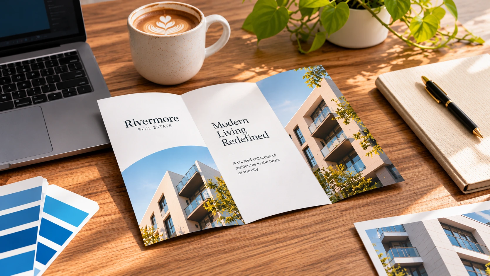
Most print problems don't start on the press. They start in the file.
A missing bleed leaves a thin white edge. A low-resolution photo prints soft. A font swaps itself out at the last minute. Each one is easy to prevent, and each one is much cheaper to fix before your artwork goes to press.
This guide covers how to prepare files for printing, step by step, with a one-page checklist at the end you can save and reuse.
What is prepress?
Prepress is everything that happens between "the design looks done" and "the press starts running." It includes your own file checks, plus the technical review a print shop does before production.
A print-ready file is one that needs nothing else done to it: the right size, the right color mode, the right resolution, and the right export format. The closer your file is to that, the faster your order moves.
Print-ready files matter because:
- They prevent reprints. Fixing a file takes minutes. Reprinting an order takes days and money.
- They avoid delays. A file that needs changes goes back and forth before it can be scheduled.
- They protect your brand. The piece in your hands matches the piece you designed.
Bleed, trim, and safe zone: the three boxes every print file needs
If you only learn one thing about file prep, make it this. Every printed piece has three boundaries.
Trim
The trim line is the finished size of your piece, where the blade cuts. A 4" x 6" postcard has a trim of exactly 4" x 6".
Bleed
Bleed is extra artwork that extends past the trim line. Paper moves slightly during cutting, so a design that stops exactly at the edge can leave a sliver of white. Bleed gives the blade room to be a hair off without showing.
A common standard is 0.125" (1/8 inch) of bleed on every side. Backgrounds, colors, and images that reach the edge should extend all the way to the bleed line. Follow the product template if it specifies otherwise.
Safe zone
The safe zone is the inner margin where text, logos, and anything important should stay. A common rule is at least 0.125" inside the trim, and 0.25" if you want a little extra room. Anything closer to the edge risks being clipped or looking cramped.
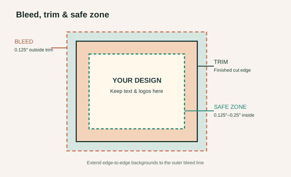
Quick example: A 4" x 6" postcard with 0.125" bleed on all sides has an overall artwork size of 4.25" x 6.25", with the trim marked at 4" x 6" and your text kept inside it.
Resolution: why 300 DPI matters
DPI (dots per inch) describes print detail; for digital image files, you'll also see PPI (pixels per inch). What matters is how many pixels the image has at its final printed size.
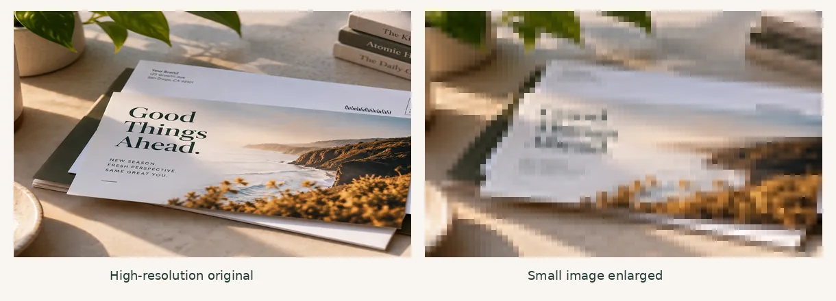
For most printed pieces, images should be 300 PPI at the final printed size. That's a useful target for crisp photos and detailed artwork.
- Size matters as much as resolution. A small image stretched to fill a brochure panel loses sharpness.
- Don't just raise the number. Changing 72 to 300 in your software doesn't create missing detail.
- Screenshots and web images may not work. Check their actual pixel dimensions rather than assuming they're print-ready.
- Large-format work is different. Banners and posters viewed from farther away may need less resolution at full size. Check the product requirements.
Use vector artwork (logos, icons, line art) wherever possible. Vectors stay sharp at any size.
Color mode: set your file to CMYK
Screens display color with light (RGB). Printers reproduce color with ink (CMYK). If your file is left in RGB, colors may shift when converted for print, and bright shades can look duller.
Set your document to CMYK before you start designing when your print provider requests a CMYK workflow. Choose colors using print-appropriate values so there are fewer surprises.
For the full explanation, including rich black and how to set up Canva and Illustrator, read our guide on RGB vs CMYK.
Fonts: outline them or embed them
If a font isn't included in your file, the printer's computer may substitute another one. Spacing changes, lines rewrap, and your layout shifts.
- Embed fonts when you export to PDF. Most programs do this with a print preset.
- Convert text to outlines (in Illustrator: Type > Create Outlines). This turns text into shapes. Save an editable copy first because outlined text can't be edited.
Also keep a few things in mind:
- Avoid tiny text. Very small type, especially reversed out of a dark background, can fill in during printing. 6 pt is a common lower limit for some processes, but larger body text is generally more readable.
- Mind your thin lines. Hairlines can disappear. 0.25 pt or heavier is a common guideline, depending on the printing method.
Export as a high-quality PDF
A PDF is a reliable format for print because it packages your layout, fonts, images, and colors into one file.
- Choose a print preset. "High Quality Print" or "PDF/X-4" are common choices. Avoid "smallest file size," which compresses images.
- Include bleed. Make sure the bleed settings are on.
- Keep the right color. Follow your printer's CMYK or PDF color-profile requirements.
- Add crop marks only if asked. Follow the product template.
- Open the exported PDF. Check fonts, images, edges, and dimensions before sending.
Don't send a JPG or screenshot of your design in place of a print-ready PDF unless the printer specifically requests it.
The one-page prepress checklist
Save this and run through it before every order. Download the one-page prepress checklist (PDF).
Size and layout
- Document is set to the product's exact finished size
- 0.125" bleed added on all sides (or as specified by the product template)
- Backgrounds and images extend to the bleed line
- Text and logos sit inside the safe zone (typically at least 0.125" from trim)
- Key content stays away from folds and fold lines
Images
- All images are 300 PPI at final size for standard print
- No undersized web or social media images
- Logos and icons are vector files where possible
Color
- Document follows the printer's CMYK/color-profile requirements
- Blacks are set intentionally (100% K for small text, approved rich black for large areas)
- Brand colors use approved print values
Type
- Fonts are embedded or outlined
- Text is proofread: names, dates, prices, phone numbers, URLs
- QR codes tested and scanning correctly
Export
- Exported as a high-quality PDF
- Bleed included in the export
- Exported PDF opened and checked at full size
Setup tips by product
Different products have different requirements, so always check the template for your specific item.
- Brochures and booklets: Keep text away from folds and the binding edge. For multi-page files, check the page order and page count.
- Postcards and flyers: Watch your safe margins and make sure full-bleed backgrounds reach the bleed line.
- Roll labels and stickers: Include the die line or cut shape when requested, and extend artwork past it. Small text and thin lines need extra care.
- Banners and posters: Resolution can be lower at full size. Leave extra margin for hems and grommets on banners.
- Menus and table tents: Check fold positions and keep important content clear of them.
Common prepress mistakes (and how to avoid them)
- No bleed. Can leave white slivers at the edge.
- Text too close to the trim. Looks cramped or gets cut off.
- Low-resolution images. Photos can print soft.
- Unexpected color conversion. Bright screen colors may reproduce differently in print.
- Missing fonts. The layout shifts when a substitute font appears.
- Wrong file size. Resizing can change the layout.
- Untested QR codes and URLs. Always scan and click before printing.
- Skipping the final proof. Read every word one more time.
What this means for your business
Print prep isn't about being a design expert. It's about building a few habits.
- Start from the right template. Correct size, bleed, and color setup remove many problems before they happen.
- Check your file once, then check it again. A quick review can prevent delays.
- Send the final, exported PDF. Not a screenshot, draft, or file dependent on missing assets.
- Ask when you're unsure. It's faster to confirm a requirement than redo a file.
Send us your files with confidence
Getting a file print-ready doesn't have to be complicated. Add bleed, keep content in the safe zone, use sufficiently detailed images, set up color correctly, handle your fonts, and export a clean PDF.
At Quixprint, we can help identify artwork setup issues before production. Whether you're printing a single run of labels or a full campaign, we'll help you get your artwork ready.
Not sure if your file is ready?
Send us your artwork and tell us what you’re printing, and we’ll help review the setup before anything goes to press.
Get in touch