
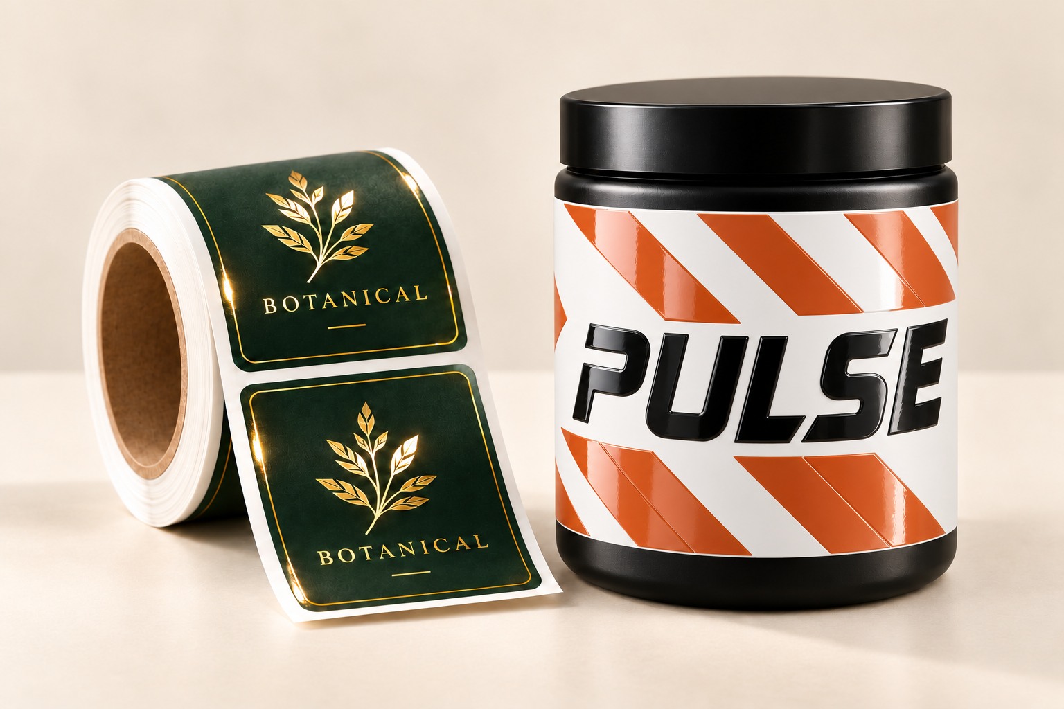
Shoppers decide fast. On a crowded shelf or in an online order, your label has a few seconds to say “this one’s worth a closer look.” Great artwork is the starting point, but the material, finish, and embellishments you choose can be the difference between a label that blends in and one that gets picked up.
Here are the main ways to make custom roll labels, stickers, and packaging labels stand out.
1. Start with the right material
The base material shapes everything that follows, including how your colors look, how the label feels, and how it holds up.
- White BOPP: A bright, smooth, moisture-resistant film that makes colors look crisp and vivid. A practical choice for food, beverage, and body care products.
- Silver BOPP: A metallic silver base that gives your label built-in shine. Colors printed directly over the silver can take on a metallic look, while a white ink underprint keeps selected areas opaque. It’s a strong option for bold, high-impact labels without adding foil.
- Clear BOPP: A transparent film that creates a “no-label” look on glass and plastic, so your design appears to be printed directly on the container. White ink can help text and colors stay visible against the product inside.
- Paper: Choose white uncoated paper or kraft paper for a natural, tactile feel that suits craft, artisan, and handmade brands. Semi-gloss paper offers a smoother surface for colorful artwork. Paper is generally better suited to dry applications.
For products exposed to water, oils, or refrigeration, consider the complete label—including the adhesive and protective finish—as well as the base material.
Not sure whether film or paper is right for your product? Our guide to BOPP vs. paper labels breaks it down.
2. Choose a finish that fits your brand
The finish changes how your label looks under light and how it feels in the hand.
- Gloss: Bright, vibrant, and eye-catching. Colors pop and the surface reflects light.
- Matte: Soft, modern, and understated, with a premium, low-glare look.
- Soft touch: A smooth, velvety feel that gives people another reason to notice the packaging when they pick it up.
Finish options depend on the stock. White uncoated and kraft paper keep their unlaminated surface, while compatible materials can be paired with matte, gloss, or soft-touch lamination.
Matte and gloss also work together. Combining a matte label with glossy highlights creates contrast that draws the eye.
3. Add spot UV varnish for shine and texture
Spot UV is a clear, glossy coating applied only to selected areas, such as a logo, product name, or pattern. On a matte label, the coated areas catch the light while the surrounding surface stays understated.
- 2D (flat) spot UV: A smooth gloss layer that highlights key elements for a sleek, modern look.
- 3D (raised) spot UV: A thicker varnish application that rises above the surface. You can see it and feel it, adding a tactile detail to your product label design.
Keep the effect focused. A glossy logo or a raised pattern can give the label more character without competing with the product name.
4. Add foil stamping for metallic brilliance
Foil adds a reflective metallic or specialty accent to selected parts of a label. It creates a distinct shine that ordinary printed color doesn’t reproduce.
- 2D (flat) foil: A smooth metallic accent for logos, lettering, borders, and other details.
- 3D (raised) foil: A raised metallic effect that adds shine and dimension together.
Foil isn’t limited to gold and silver. Available roll-label foil colors include gold, silver, rose gold, blue, red, and holographic.
Silver BOPP and foil serve different purposes: silver BOPP gives the label a metallic base, while foil adds a reflective accent in specific places. Choose based on where you want the shine to appear.
5. Consider shape and size
A standard rectangle works, but a distinctive shape can get noticed before anyone reads a word. Circles, ovals, and custom-cut shapes give you more ways to complement your container and brand.
Size matters too. A label that wraps around a container or fills its front panel makes a different statement than a small, centered label with plenty of open space around it.
Measure the usable labeling area before choosing a size. Curves, seams, and tapered surfaces can affect how smoothly the label applies.
6. Design for impact
Even the best label materials and finishes need strong design to shine.
- Use color on purpose. Bold, high-contrast palettes grab attention, and the right colors reinforce your brand. See Why Color Matters in Print and Marketing.
- Keep it simple. One clear focal point beats a cluttered layout. Make the product name and its main benefit easy to find.
- Use embellishments as accents. Spot UV or foil on a logo or key detail is often more effective than covering the whole label.
- Keep text legible. Very fine lines and tiny type can lose definition in foil and raised finishes. Review the artwork at its actual printed size.
- Think about the product. Consider the container’s shape, color, and surface so your label complements it.
Quick guide: match the effect to the goal
| If you want… | Try… |
|---|---|
| Built-in metallic shine | Silver BOPP |
| A “printed on the bottle” look | Clear BOPP |
| A natural, handcrafted feel | White uncoated or kraft paper |
| Subtle contrast and gloss | 2D spot UV on a matte finish |
| A tactile, raised design | 3D spot UV or 3D foil |
| A bold metallic accent | 2D foil stamping |
| A soft, velvety feel | Soft-touch lamination |
| Shine and raised detail together | Foil and raised spot UV, with placement reviewed for your artwork |
Make every detail count
Making your labels stand out starts with a material that suits your product, a finish that matches your brand, and one or two details that highlight what matters most.
Whether you’re launching a new product or refreshing an existing one, a thoughtful combination of color, texture, and shine can make a lasting impression.
Have a project in mind?
Tell us what you’re printing, and we’ll help you choose the right material, finish, and embellishments.
Explore roll labels